Turning telecom solutions
into clear visual narratives
This project combines a tech-inspired aesthetic with a human-centered approach to storytelling. Using outlined icons, sharp lines, and human figures, it blends technology and people. The design employs clean visuals to convey innovation, authority, and leadership, staying approachable.
The objective
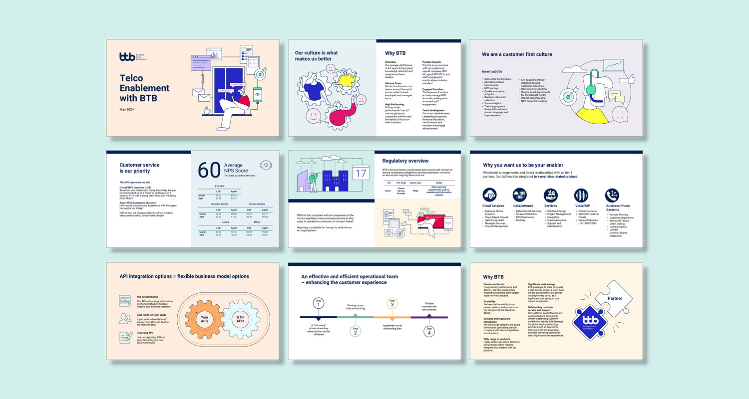
For BTB Australia, the goal was to simplify and communicate the complex technical details of their telecommunications products. The challenge was to make these concepts easily understandable for a wide range of audiences, particularly businesses that were not familiar with telecom services.
The solution
To meet this objective, I developed a cohesive visual identity, including engaging video animations, social media tiles, icons, and PowerPoint presentations. These assets embraced a tech-inspired style with sharp lines, clean icons, and human elements to ensure the design was approachable yet authoritative. The animations simplified complex concepts, conveying BTB’s offerings effectively.
The outcome
The final deliverables were highly successful in clarifying BTB’s telecom products, helping customers better understand the technical aspects of their services. The cohesive visual identity not only strengthened BTB’s brand but also improved customer engagement across multiple channels, effectively communicating BTB’s expertise and approachability.
Microsoft Powerpoint presentation design
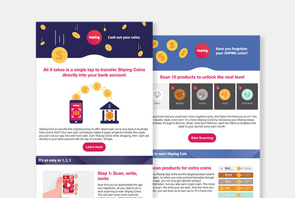
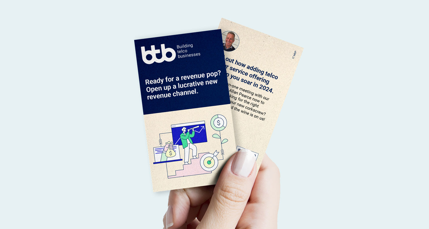
Flyer design
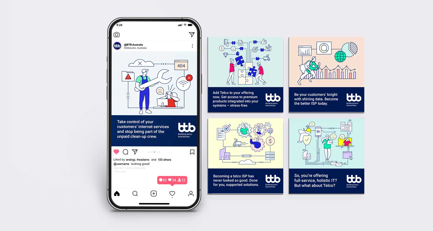
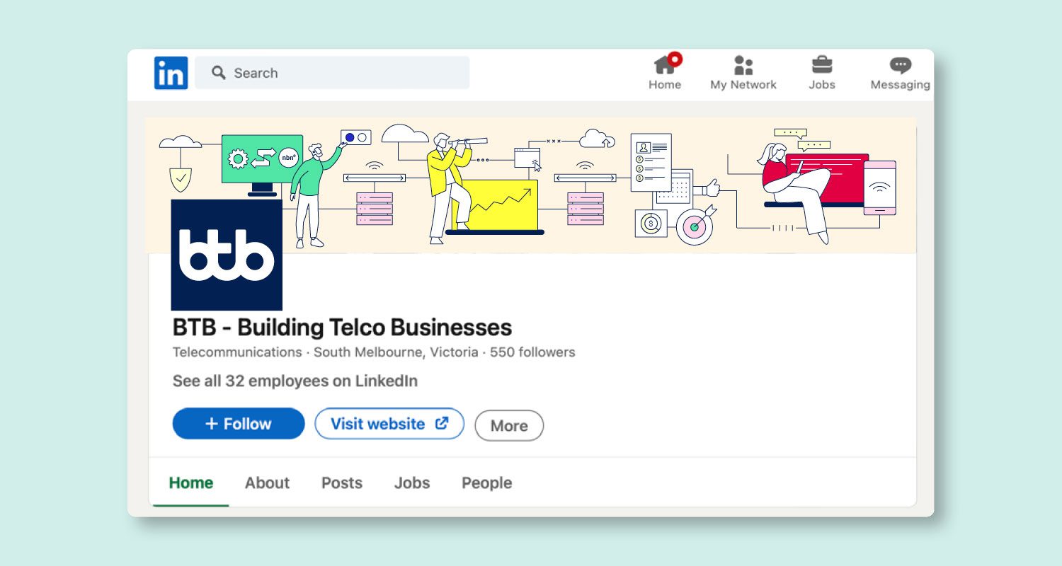
Social media design
Illustration
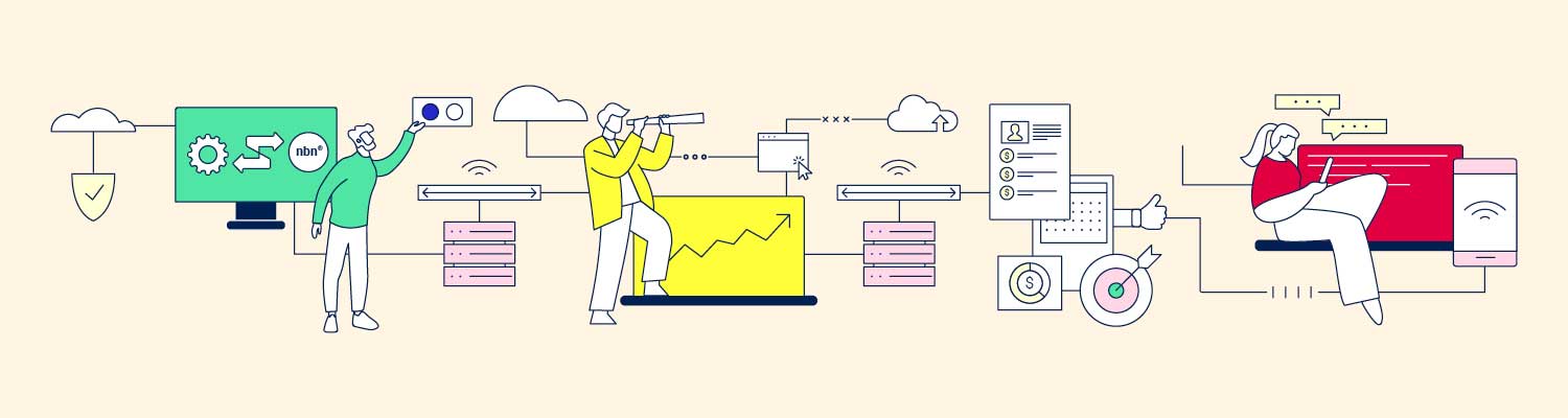


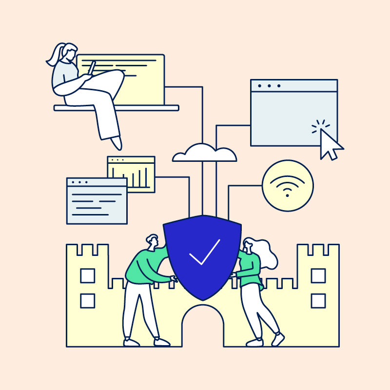
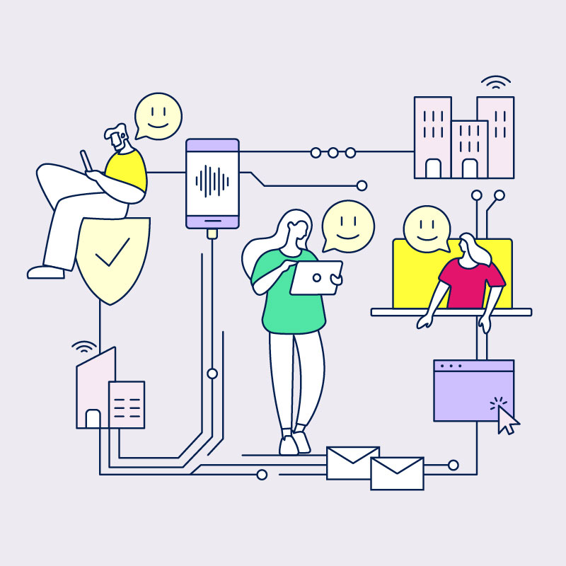


A key component of the design were the illustrations that depicted both technology and human interaction. I created a series of icons and illustrations that were clean, simple, and bold. The illustrations featured outlined figures and devices, allowing for clarity and focus on key elements of the telecom services. These visuals helped bridge the gap between technical jargon and user-friendly imagery, making the content accessible and engaging.
Animation
Animation
The animations were designed to bring the technical information to life, transforming complex concepts into digestible visual stories. Using a combination of sharp lines, smooth transitions, and subtle motion effects, the animations guided the viewer through the features and benefits of BTB’s products. The animations focused on conveying key messages in a dynamic, easy-to-understand format, ensuring that even the most intricate details were clearly communicated.
Client
Credits*
- Department: Brand and Marketing
- Directors: Brendon Brackin, Kirsten Craven
- Illustration: Freepik and myself
- Animation: Myself
Deliverables
- Animation
- Branding
- Flyers
- Illustration
- Social media posts
*If any credit or attribution has been inadvertently omitted, please contact me directly. It was not intentional, and I am committed to including all appropriate credits where possible. This website strives to respect all copyright and intellectual property rights. Should there be any errors or oversights, I will take immediate action to resolve them.