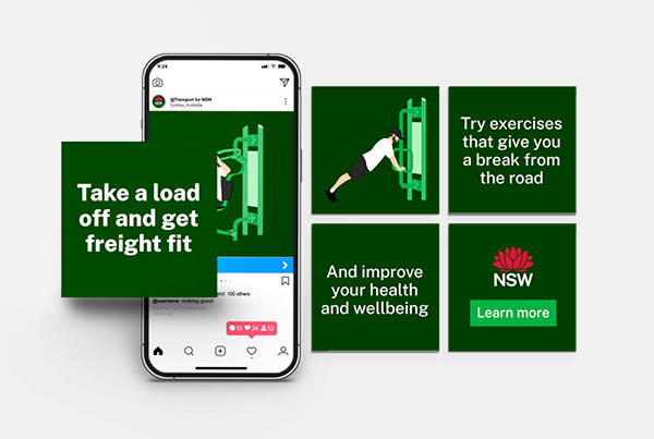
Reimagining the
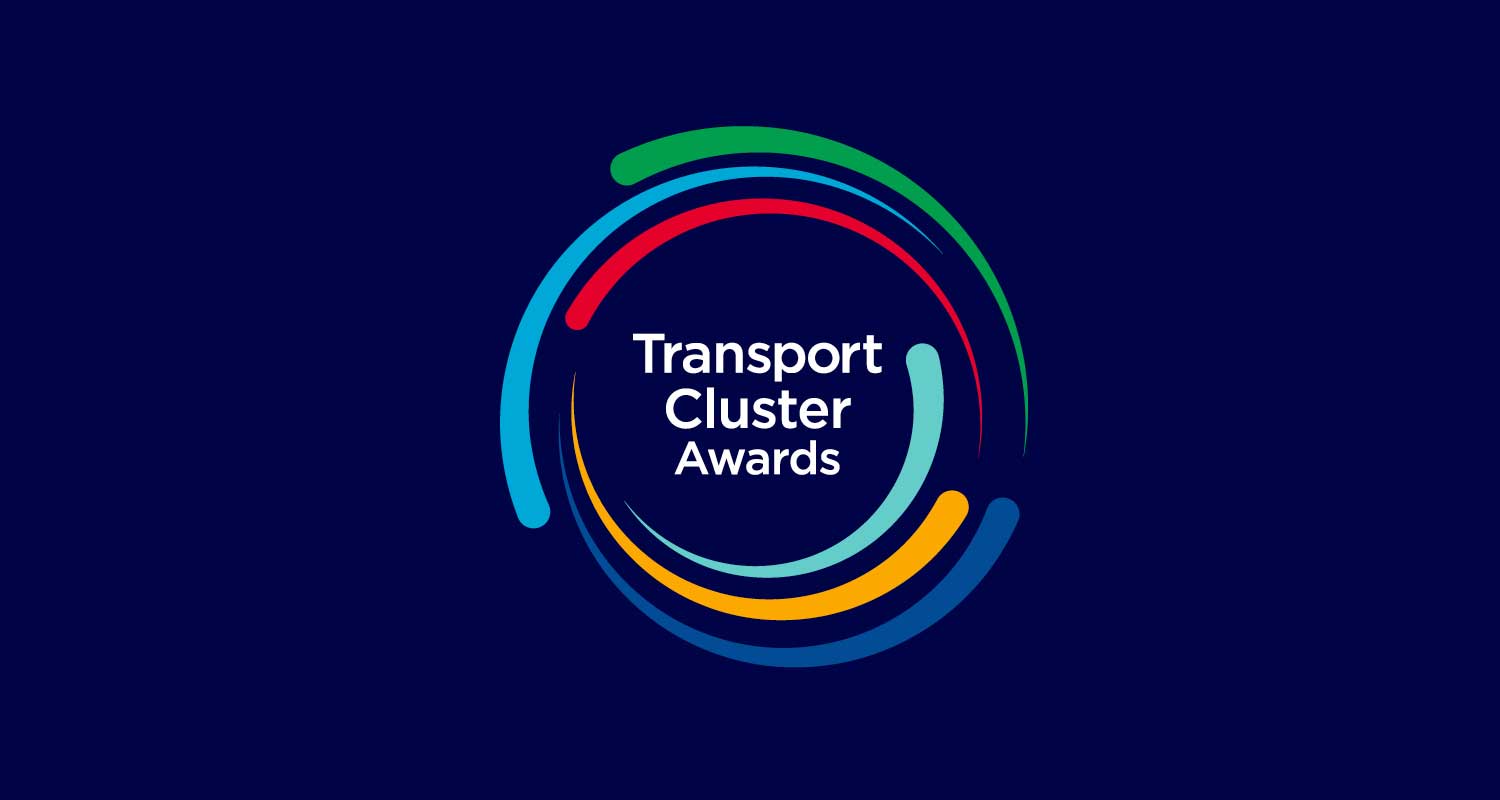
Transport Cluster Awards
Transport for NSW, offering public transport in New South Wales, needed a redesign of their internal awards branding, including a logo, certificates, presentations, email footers, and web banners for voting. The previous design was outdated and didn’t reflect the organization’s values.
The solution
The new logo was designed as a ‘star burst,’ with each burst symbolizing one of the company’s core values. While each burst is distinct, together they form a unified whole, representing the Transport Cluster. The design features a strong sense of movement, reflecting Transport’s ongoing change, growth, and development.
The outcome
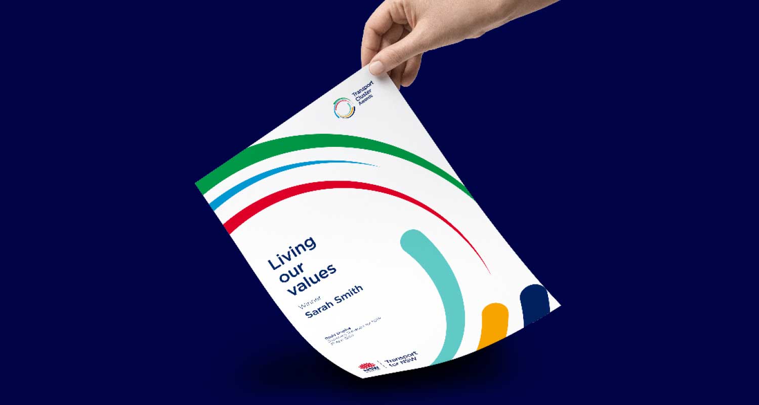
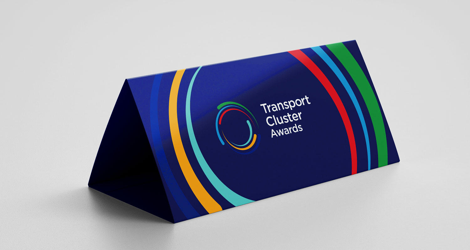
The redesigned logo was applied across multiple outputs, including certificates, presentations, email footers, and web banners for voting. Employees were highlighted and celebrated for embodying the core values of the company, helping to revitalize the awards ceremony and reinforce the commitment to growth and innovation.
Logo design
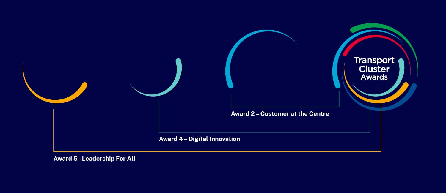
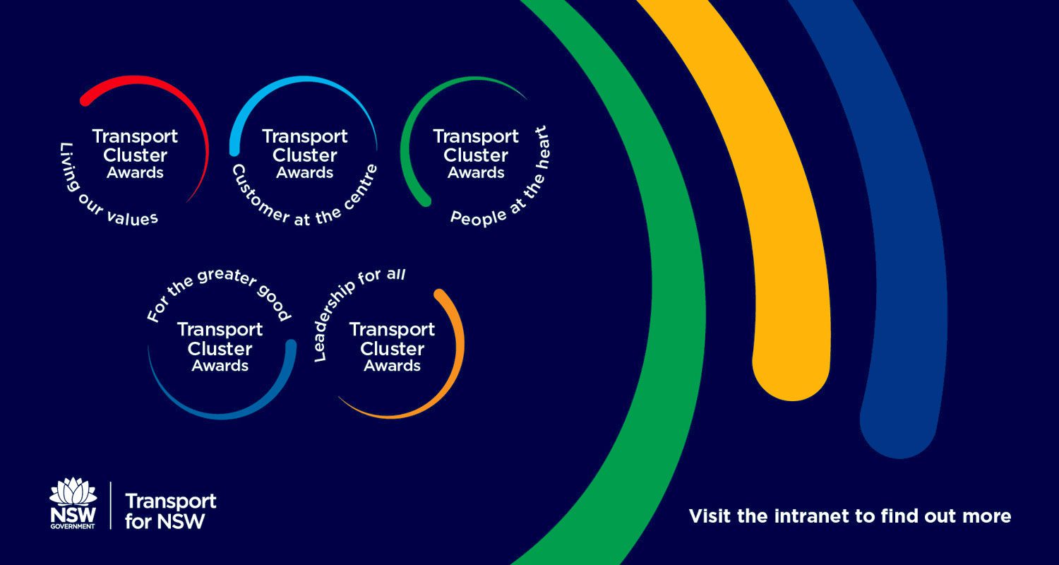
Colour selections representing specific awards
One colour representing the cluster of awards
Award 1 – People at the Heart
Award 2 – Customer at the Centre
Award 3 – Living Our Values
Award 4 – Digital Innovation
Award 5 – Leadership For All
Award 6 – For the Greater Good
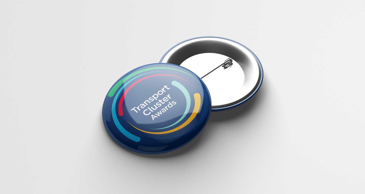
Award pins
Award Certificates
Printed Lecterns
PowerPoint Award Presentation
Client
Credits*
- Department: Brand and Marketing and Creative Services
- Directors: Allison Lee, Karen Mork, Ashleigh Lane
- Illustration: Myself
Deliverables
- Digital tiles
- Icon suite
- Illustration
- Logo redesign
- PowerPoint templates
*If any credit or attribution has been inadvertently omitted, please contact me directly. It was not intentional, and I am committed to including all appropriate credits where possible. This website strives to respect all copyright and intellectual property rights. Should there be any errors or oversights, I will take immediate action to resolve them.


