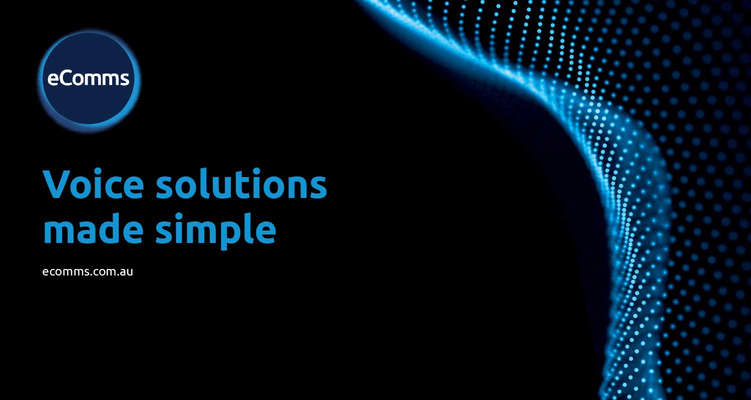
Redefining eComms:
a new playful brand identity
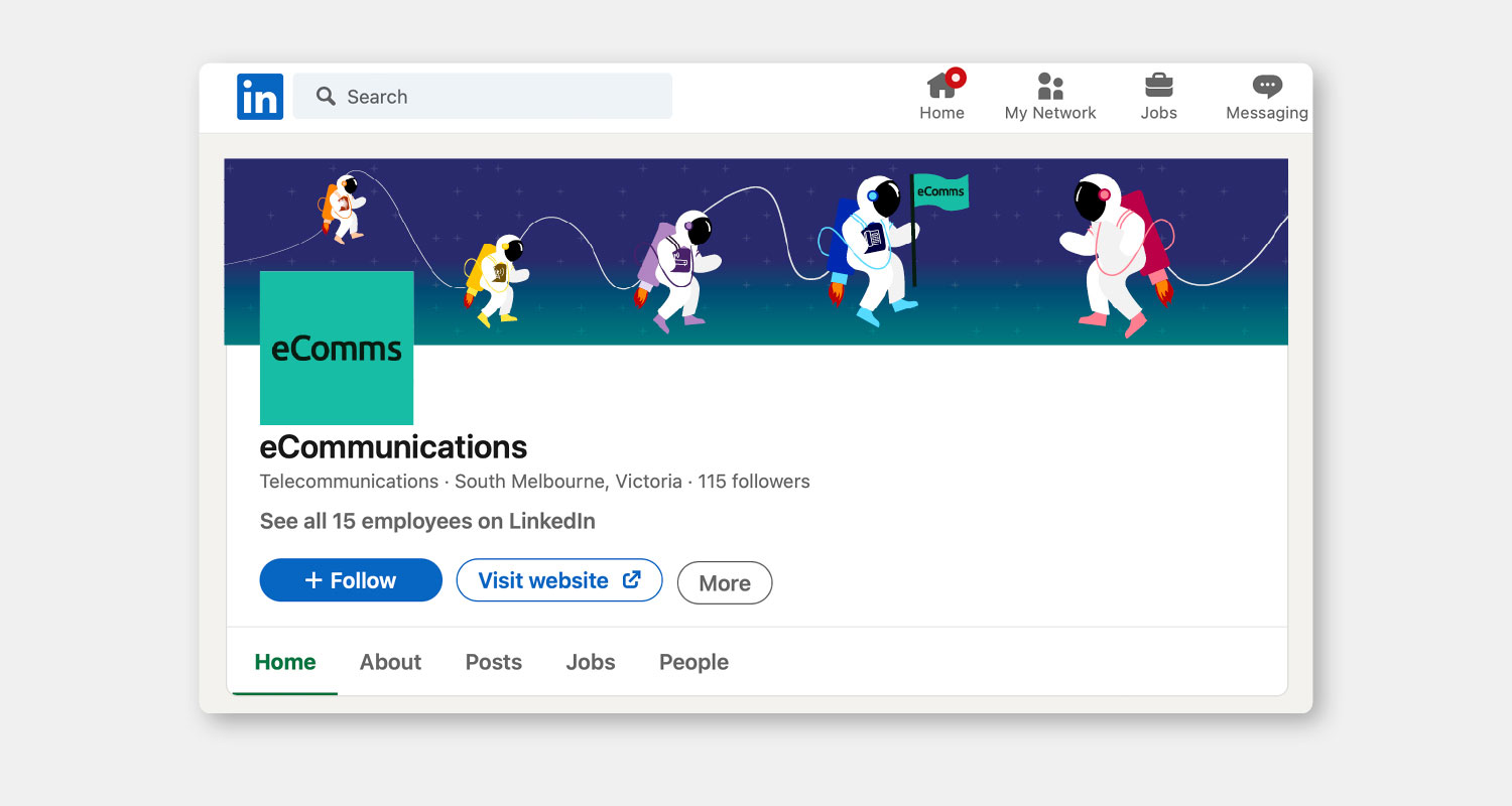
eComms is a telecommunications company, under the BTB Australia umbrella, that specialises in providing innovative communication solutions and services directly to customers.
The objective
Since eComms is an umbrella brand of BTB, they aim to establish a distinct identity to avoid looking or sounding the same. While BTB is focused on business-to-business interactions, eComms is directed towards direct, customer-facing engagement. To achieve this, their goal was to move away from a corporate aesthetic and adopt a more approachable, consumer-friendly brand style.
The solution
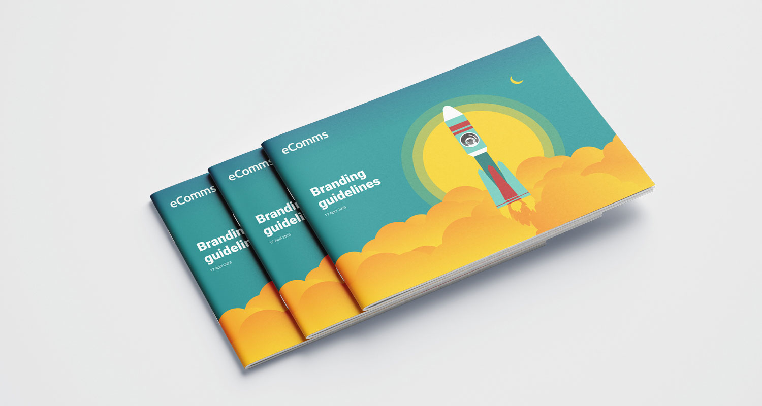
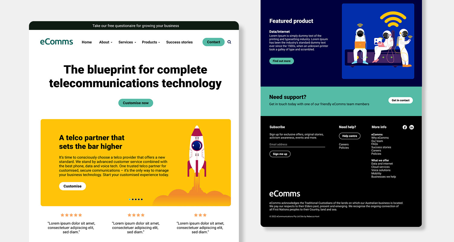
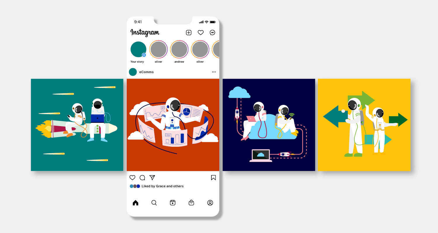
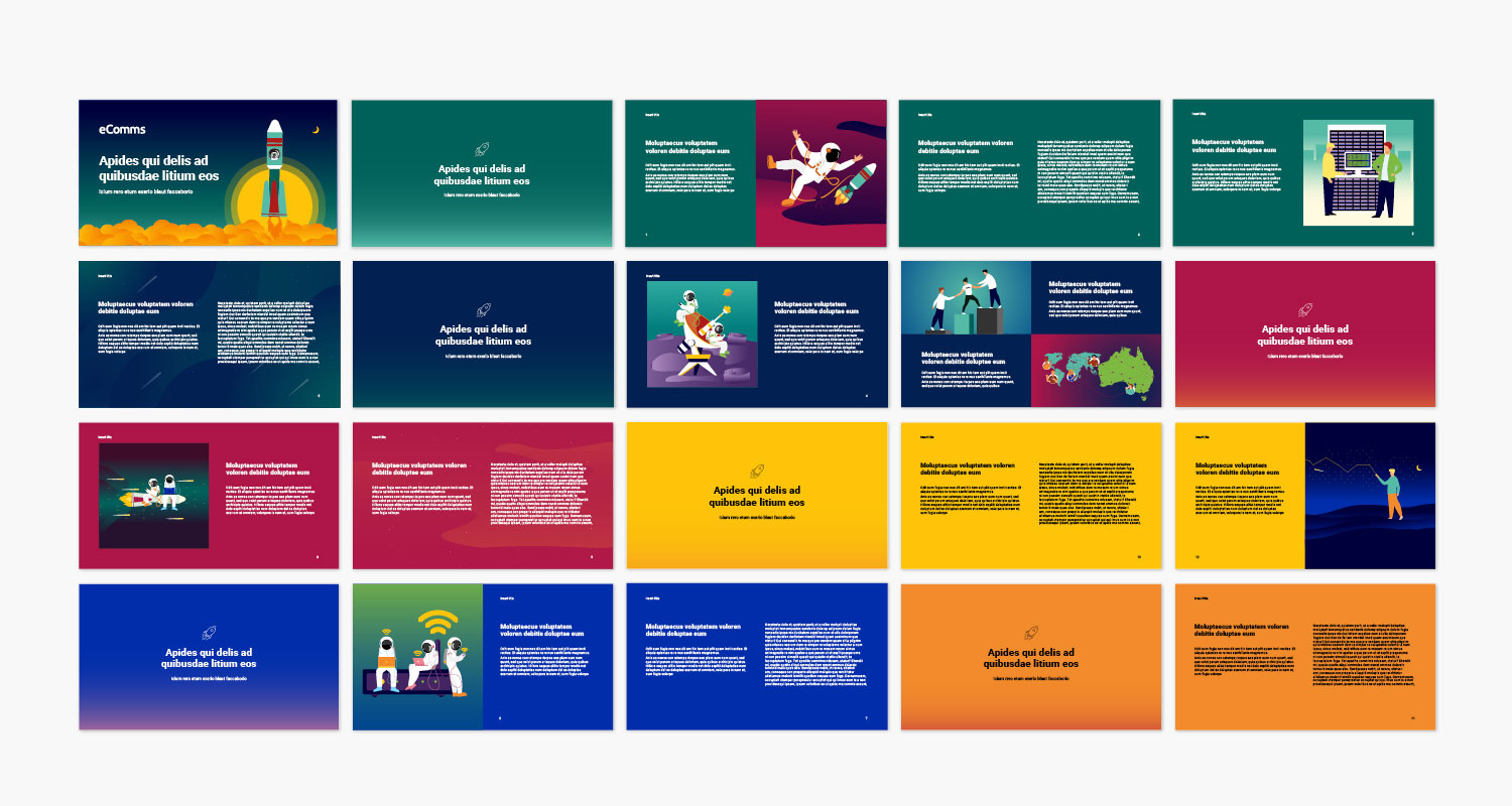
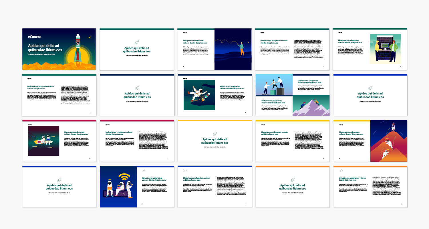
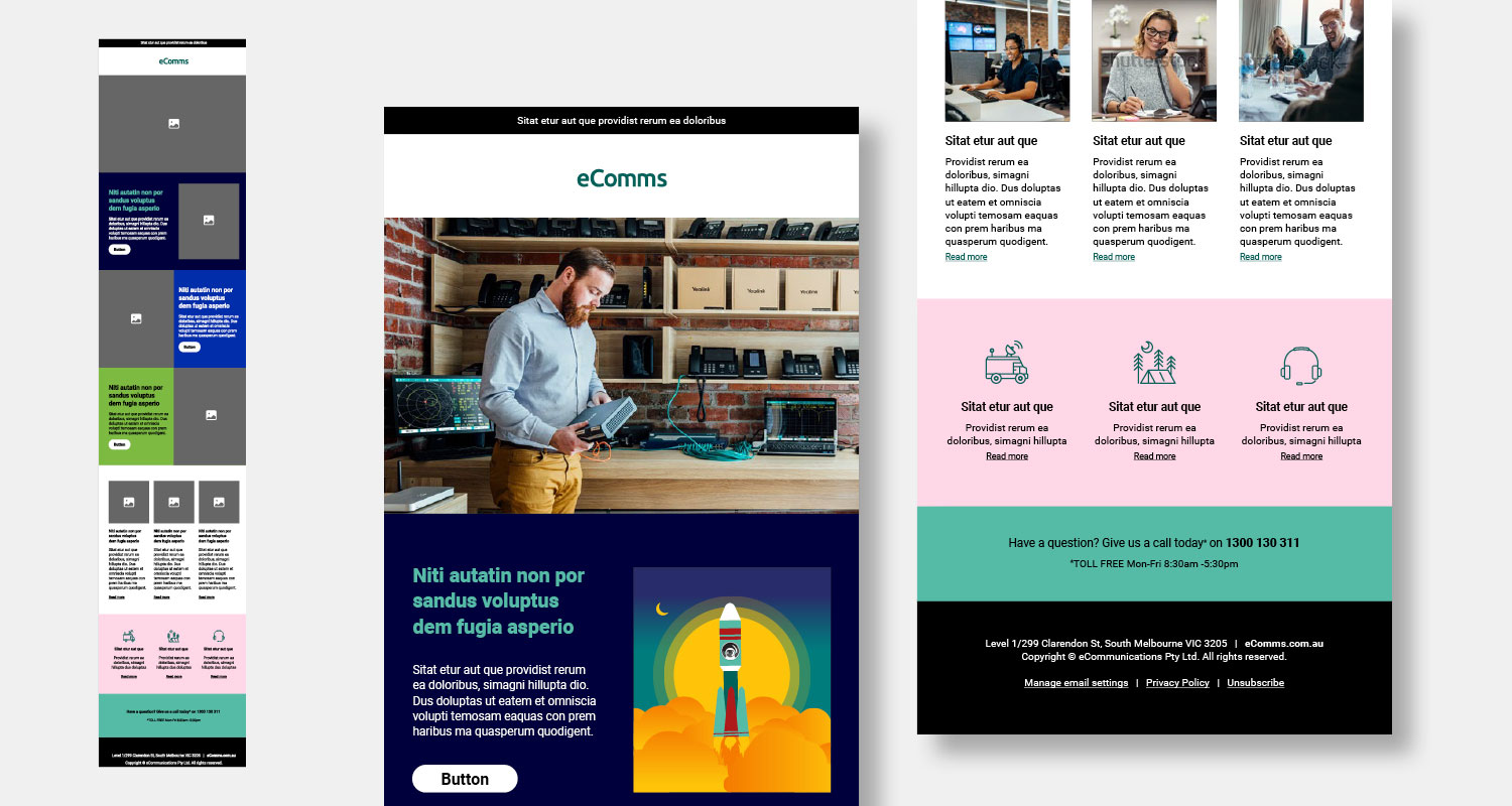
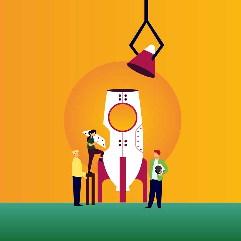
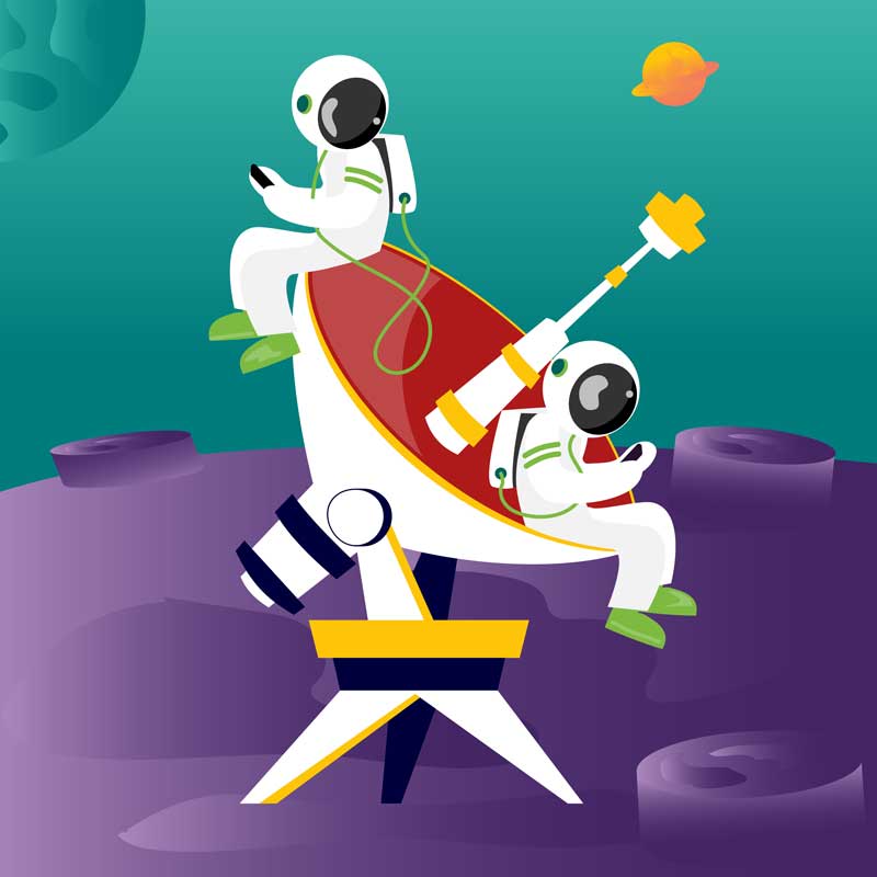
Unlike BTB Australia’s corporate aesthetic, eComms uses lively illustrations, including astronauts, to create a playful, approachable brand that embodies exploration and innovation. With bright, accessible colours, eComms offers a fresh, modern look that contrasts with BTB Australia’s more traditional style. The simplified logo enhances accessibility and flexibility, making it adaptable and consumer-friendly.
The outcome
As a result of these design strategies, eComms consistently creates a compelling user experience across multiple applications, from digital platforms to print materials. This approach enhances understanding of its products and services while fostering trust and engagement with its audience, ultimately leading to a more informed and confident customer base.
Rebranding eComms
Old look and feel
The previous design was dark, serious, and geared toward B2B customers. The client wanted a more personable brand that appealed to consumers and stood out from both competitors and its corporate sister. The limited blue color palette also posed accessibility issues, making it hard for a wider audience to engage.

New look and feel
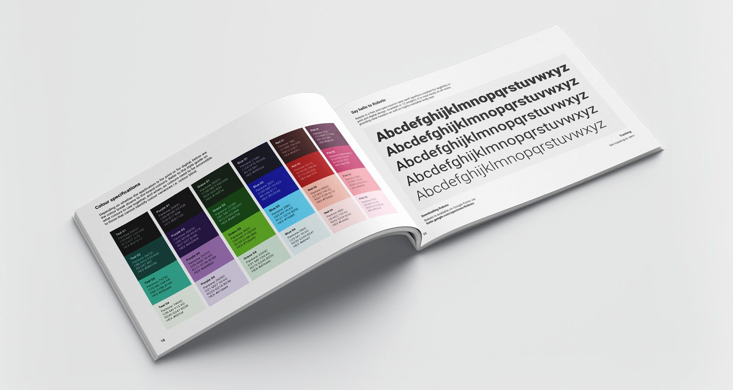
I introduced a fresh, fully WCAG-tested color palette to brighten the brand and make it more approachable. The style guide includes clear guidelines for text colors and sizes. I updated the outdated font to a modern typeface, reflecting the brand’s cutting-edge services. Illustrations were added to convey the brand’s offerings in a fun, relatable way, capturing attention without being overly technical.
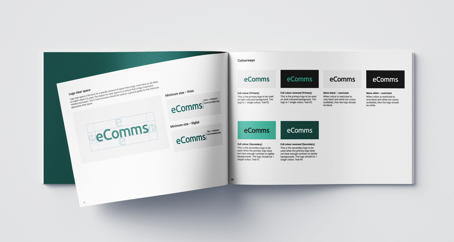
Logo refresh
Old logo
The previous logo presented several challenges, including the use of gradients that hindered printing and complicated file size management. The ecomm text was too small, forcing the logo to be oversized just to maintain legibility. Additionally, the logo wasn’t WCAG-compliant due to poor text size and color choices, limiting accessibility.
New logo
I revamped the logo by removing the gradients and the enclosing circle around the ‘ecomms’ text, resulting in a clean, text-based design. This improved size and legibility, making the logo more versatile. The text color was updated to a green tone, differentiating it from the B2B sister brand. The new color was WCAG-tested, proving more legible and accessible. With the circle removed, the logo size could be increased for better readability and WCAG compliance.
New colour palette (WCAG approved)
Teal 01
Purple 01
Grass 01
Blue 01
Red 01
Teal 02
Purple 02
Grass 02
Blue 02
Red 02
Teal 03
Purple 03
Grass 03
Blue 03
Red 03
Teal 04
Purple 04
Grass 04
Blue 04
Red 04
Pink 01
Orange 01
Yellow 01
Black 01
White 01
Pink 02
Orange 02
Yellow 02
Black 02
White 02
Pink 03
Orange 03
Yellow 03
Black 03
White 03
Pink 04
Orange 04
Yellow 04
Black 04
White 04
Typography
Roboto Bold
Aa
A B C D E F G H I J K L M N O P Q R S T U V W X Y Z
a b c d e f g h i j k l m n o p q r s t u v w x y z
Roboto Regular
Aa
A B C D E F G H I J K L M N O P Q R S T U V W X Y Z
a b c d e f g h i j k l m n o p q r s t u v w x y z
Styleguide
Website design
Social media design
Powerpoint presentation templates
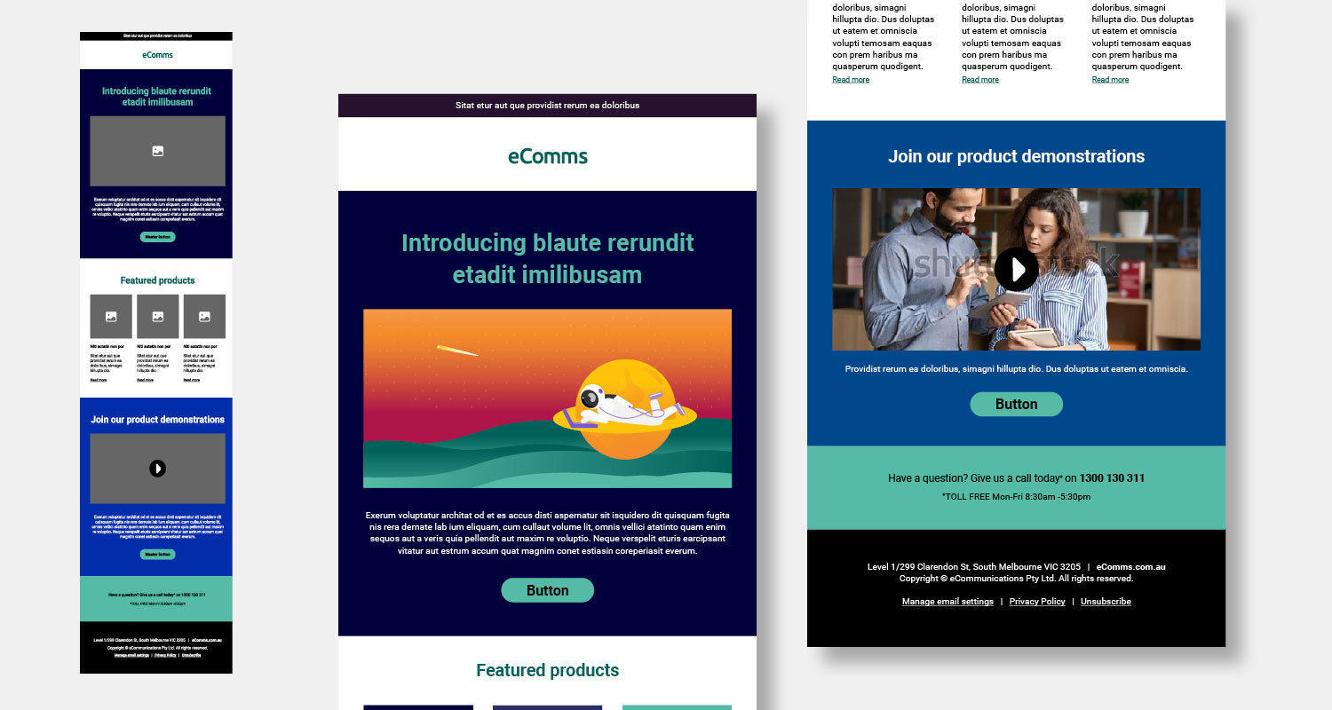
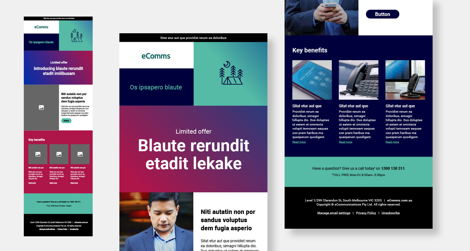
EDM templates
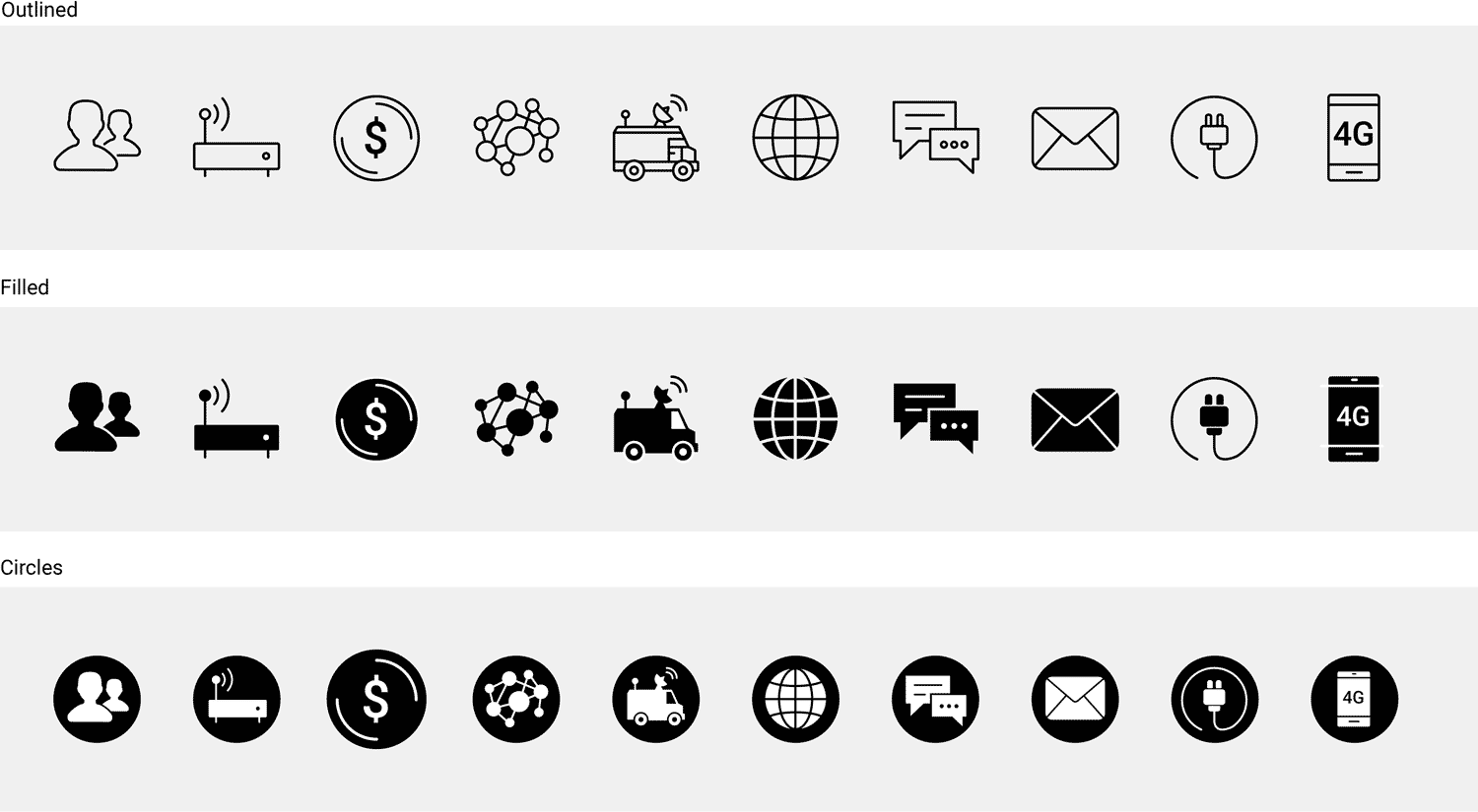
Iconography
Illustration


Animation
Client
Credits*
- Department: Brand and Marketing
- Directors: Brendon Brackin, Kirsten Craven
- Illustration: Freepik and myself
- Animation: Myself
Deliverables
- Animations
- Comprehensive style guide
- Digital tiles
- EDM templates including wireframes
- Icon suite
- Illustration suite
- Logo redesign
- PowerPoint templates
- Social posts and stories
- Styleguide
- Typography exploration
- Website design, for desktop and mobile, including wireframes
- WACG tested colour palette
*If any credit or attribution has been inadvertently omitted, please contact me directly. It was not intentional, and I am committed to including all appropriate credits where possible. This website strives to respect all copyright and intellectual property rights. Should there be any errors or oversights, I will take immediate action to resolve them.