Establishing a unified
Shping brand presence
Shping is an Australian tech company that uses blockchain to offer product transparency, allowing consumers to verify authenticity and trace supply chains. Users earn Shping Coins for scanning items, leaving reviews, and engaging with brands, which can be redeemed for discounts and offers.
The solution
A comprehensive branding system was created, including guidelines for logo placement, colour schemes, typography, iconography, and photography style. These elements were designed to work in harmony, providing Shping with a consistent visual identity that could be applied across all marketing materials.
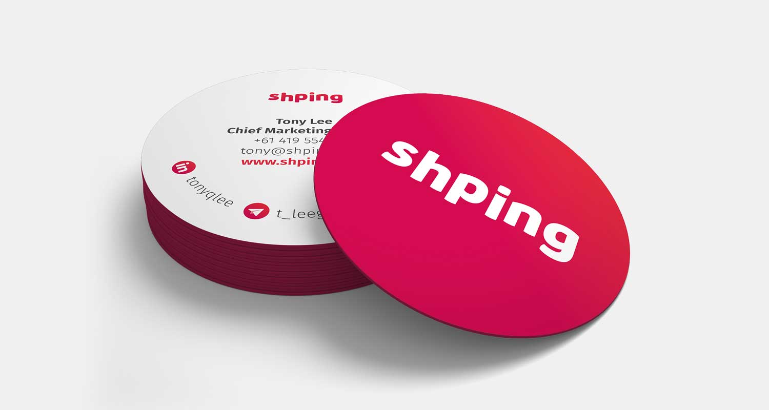
Business cards
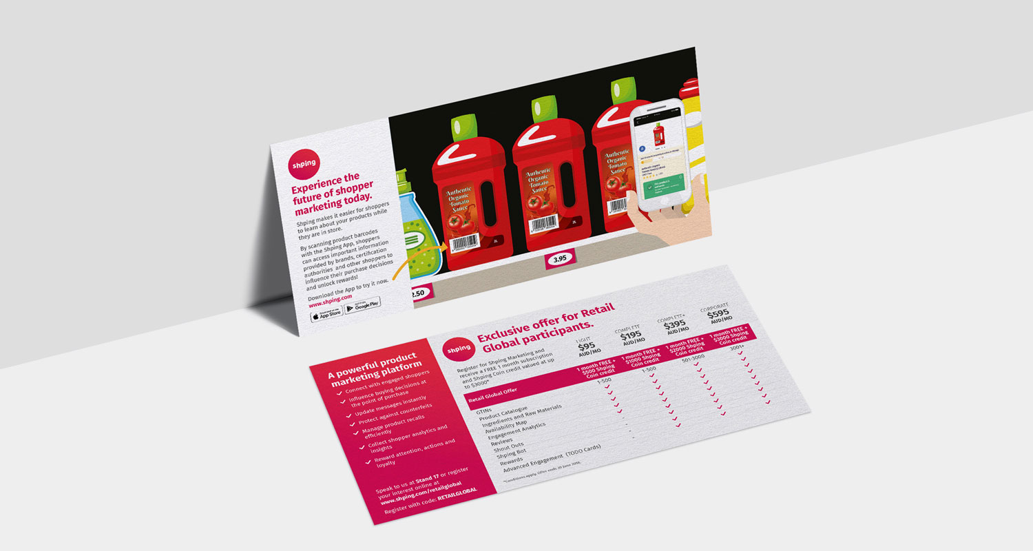
Flyers

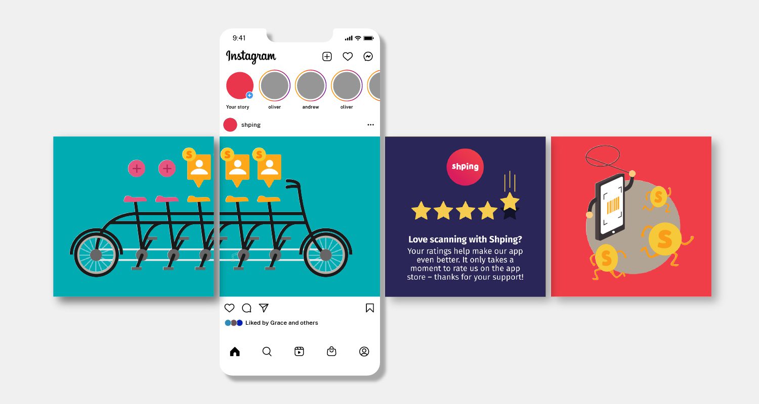
Social media design
App design


Iconography

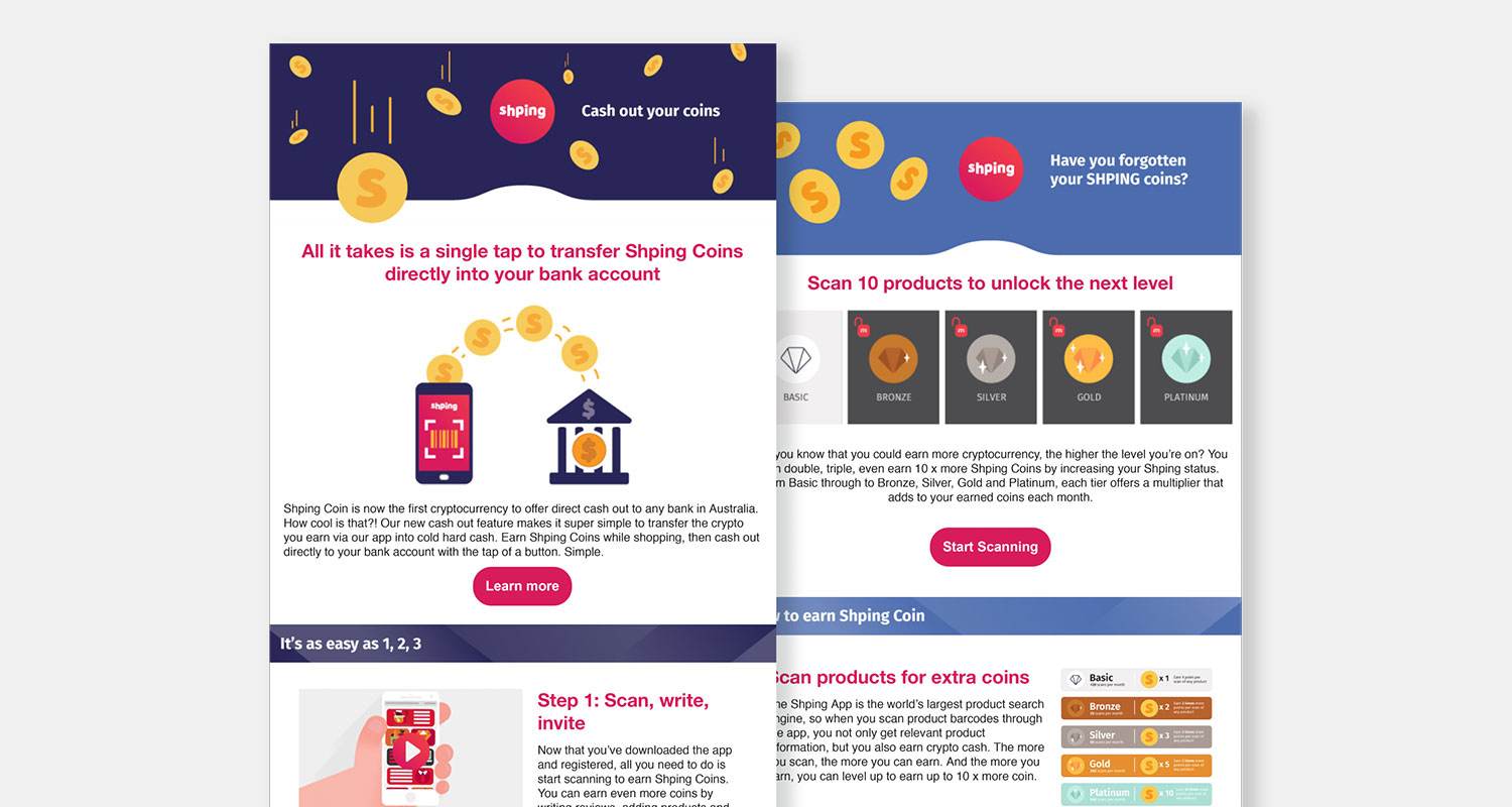
EDM templates
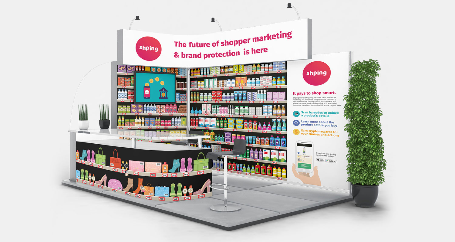
Exhibition design
Client
Credits*
- Directors: Genandy Volchek, Maryann Separovic, Tony Lee
- Illustration: Shutterstock and myseld
- Photography: Behance mockup PSDs
Deliverables
- Business cards
- EDMs
- Flyers
- Illustrations
- Icons
- Posters
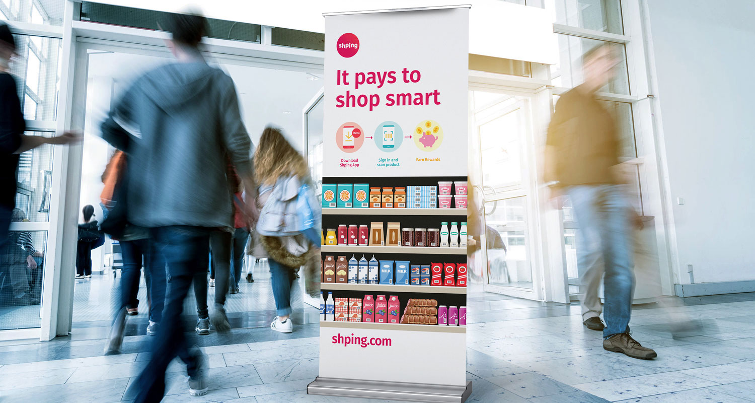
- Pull-up banners
- Showroom displays
- UI design
*If any credit or attribution has been inadvertently omitted, please contact me directly. It was not intentional, and I am committed to including all appropriate credits where possible. This website strives to respect all copyright and intellectual property rights. Should there be any errors or oversights, I will take immediate action to resolve them.

